> For the complete documentation index, see [llms.txt](https://knowledgebase.ajaxsearchpro.com/llms.txt). Markdown versions of documentation pages are available by appending `.md` to page URLs; this page is available as [Markdown](https://knowledgebase.ajaxsearchpro.com/miscellaneous/tutorials/demo-setup-staff-search-and-filter.md).
# Demo setup: Staff search and Filter
[](https://ajaxsearchpro.com/staff-search-filter/)
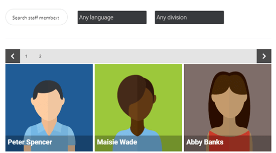
This tutorial is to help you re-create the [Staff search and Filter](https://ajaxsearchpro.com/staff-search-filter/) example from the demo page. Please note, that the example on the demo uses a different post type ‘staff’ with custom fields and taxonomies. In this tutorial we are going to use posts and post categories and tags as filters. The outcome is the same – a search bar and options in a row, and results in a separate row.
## Configuring the search for this layout (optional)
After you have created a search instance for this layout, follow these steps to make it look almost identical to that example.
#### Step 1 – Loading the theme & Behavior
On the *Theme Options* panel, choose any of the Plain themes, I used *Playin Round isotopic*. Wait for it to load, and the proceed to the next step.

I also want to keep the results open whenever the user clicks outside the results container.

#### Step 2 – category or taxonomy filter
Now, let us create two filters. I have decided to use two separate filters, one for categories and one for tags. To create the category filters, go to the *Frontent Search Settings -> Categories & Taxonomy terms* panel.

Since we want a drop-down layout, but by default it will display checkboxes, click on the *Change display mode* button to change that as well.

I also want the filters to display the "Choose one" option by default, so the user can set the filters later on.

#### Step 3 – tags filter
Now switch to the Post Tags panel to make a tags filter as well.

#### Step 4 – correct filter box layouts
Now we have two filters, but the layout is not exactly how we need it. So click on the General sub-panel and change these options as well. These options will ensure, that:
* The settings switch is not visible, as we don’t need it
* The settings box is visible by default
* The settings box position is bloc, not a hover below the search bar
* and that the layout prefers flexing through the page width first, not as columns first.

#### Step 5 – hiding generics
Since we don’t want any generic selectors (like exact matches, search in content etc..), just remove them on the same panel as before (scroll down), by clicking on the (-) button on each item.

#### Step 6 – Auto populate
Enabling the auto populate feature is also a nice addition, as by default the plugin will show results on page load.

#### Step 7 – A few more cosmetics
These steps are optional, it is just the sake of complete guide. Additionally you can change the results title font to a white colour, as it fits much better. Any vibrant colour will do, actually.

The loading icon can be positioned to the results box, if desired.


Turning off the content from the results can be visually more appealing for the isotopic results layout too.

### Solution 1: Using Gutenberg editor
Gutenberg has Rows and Columns, which you can use to add the search shortcodes or blocks.
First, make a 33/66 Column layout, then add the search block to the first, and the settings block to the second column.

After the columns block, add the search results block.

If you experience misalignments, you can use some custom CSS to adjust the settings box margin:
```
.asp_sb, .asp_s {
margin-top: -16px !important;
}
```
### Solution 2: Using the shortcode builder
The plugin has a built in shortcode builder feature, which allows you to make a custom layout for each search element: search bar, settings and results box. To access this feature, click on the *Shortcode Generator* button on the search instance settings page.

After that, a pop-up will show up, which allows you to add/remove certain search box elements, and generates a shortcode output – which you can then use in post/page contents in the editor.
A layout I was using during testing was the following.
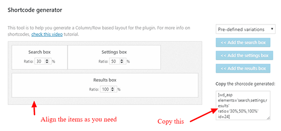
Copy the shortcode generated, and paste it into the page where you want the search filter to be displayed.

#### Optional custom CSS
Sometimes the search bar and the settings alignment can be problematic, as it can be affected by theme CSS as well as other styles. The simplest solution is to add some top margin to the search box, until it seems aligned properly. I usually start with 20px, then increase/decrease it as needed.
This custom CSS can be placed to the Custom CSS input box under the Theme Options panel in the search options.

### Solution 3: Using Visual Composer or other page builder
Page builders offer a great way to simply create and position the page contents without actual coding. Using rows and columns is very easy to re-create this layout. In this example, I have:
* Created 2 rows, marked as *Row 1* and *Row 2* on the picture
* Separated Row 1 to two colums, in 1:4 ratio.
* Placed the Search shortcode element to the first column (Row 1), the Settings shortcode element to the second column (Row 1) and Results shortcode element to the full-width Row 2.
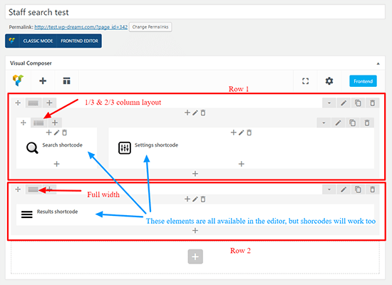
..also, make sure that the correct search instance is choosen for each element.

If you use a different page editor, don’t worry, it definitely supports shortcodes. So basically you can simply place the search, settings and the results shortcodes to these rows, like so:

You can lear more about these shortcode is the [Search shortcodes section](https://wpdreams.gitbooks.io/ajax-search-pro-documentation/content/getting_started/search_shortcodes.html) of the documentation.
(optional) If the search box alignment is higher or lower relative to the settings box, adding positive or negative top margin can do the trick. Visual composer supports that out of the box.

### Solution 3: Using custom HTML code and shortcodes
If you prefer inline HTML, it is possible as well. Use this code within the page editor. Also, make sure to change the shortcode IDs to the search ID in your case.
```markup
[wpdreams_ajaxsearchpro id=1]
[wpdreams_asp_settings id=1 element='div']
[wpdreams_ajaxsearchpro_results id=1 element='div']
```
This is however a much delicate solution, and might require some fine-tuning as well.